Where writing becomes art.
The Art of
Calligraphy
Calligraphy transforms everyday letters into deliberate, structured visual expressions. Explore the history, techniques and tools behind this enduring art form — from broad-edge traditions to contemporary pointed-pen styles.

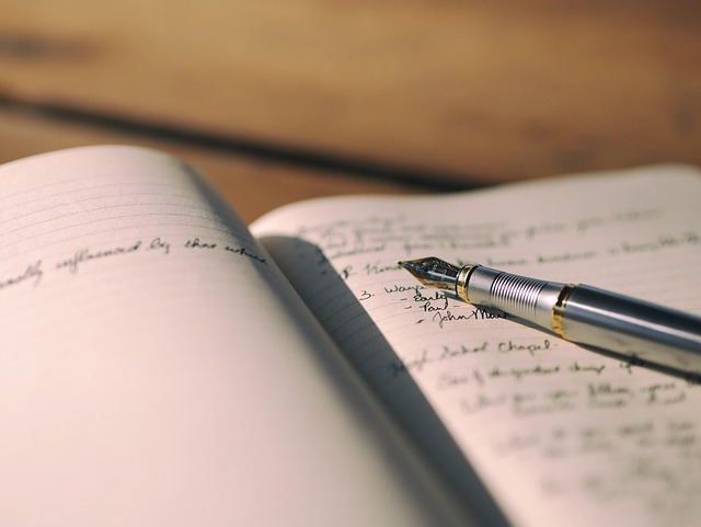
Understanding Calligraphy
More Than Beautiful Writing
The deliberate creation of visually structured letterforms.
Calligraphy is far more than simply writing neatly. It is the deliberate, conscious creation of letterforms where every stroke, every curve and every space is carefully considered. The word itself comes from the Greek kallos (beauty) and graphein (to write) — the art of beautiful writing.
Unlike everyday handwriting, which prioritises speed and communication, calligraphy slows the process down. Each letter is constructed from a series of intentional strokes, with careful attention to angle, pressure, spacing and rhythm. The result is writing that functions simultaneously as communication and as visual art.
Calligraphic traditions exist in virtually every writing culture. Western calligraphy draws from Roman, Uncial, Gothic and Italic traditions developed over centuries. East Asian calligraphy — in Chinese, Japanese and Korean traditions — treats the brush as an extension of the calligrapher's body and spirit. Arabic calligraphy celebrates the flowing beauty of the Arabic script with distinctive styles such as Naskh, Thuluth and Diwani.
Today, calligraphy continues to evolve. Modern calligraphers blend traditional techniques with contemporary aesthetics, creating lettering for wedding invitations, branding, art prints, envelope addressing and personal creative expression. Whether practised as a meditative discipline or a creative outlet, calligraphy offers a deeply satisfying connection between hand, tool and page.
Calligraphy Styles
Exploring Different Traditions
Each style carries its own history, tools and aesthetic character.
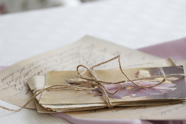
Italic & Foundational
Broad-edge calligraphy uses a flat-tipped nib held at a consistent angle. This natural angle produces thick and thin strokes automatically as the pen moves across the page. Italic, Foundational and Uncial hands all belong to this family, each with distinct letter structures and historical origins.
- Consistent pen angle creates natural contrast
- Strong rhythmic quality
- Accessible entry point for beginners
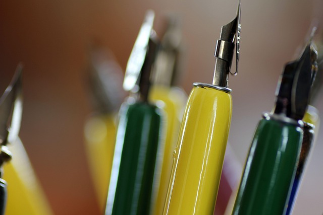
Copperplate & Spencerian
Pointed pen calligraphy uses a flexible nib that opens under pressure, creating thick downstrokes and hairline upstrokes. Copperplate, Spencerian and modern pointed-pen styles belong to this family. The contrast between thick and thin strokes gives these scripts their elegant, flowing character.
- Pressure variation creates stroke contrast
- Flowing, connected letterforms
- Popular for contemporary applications
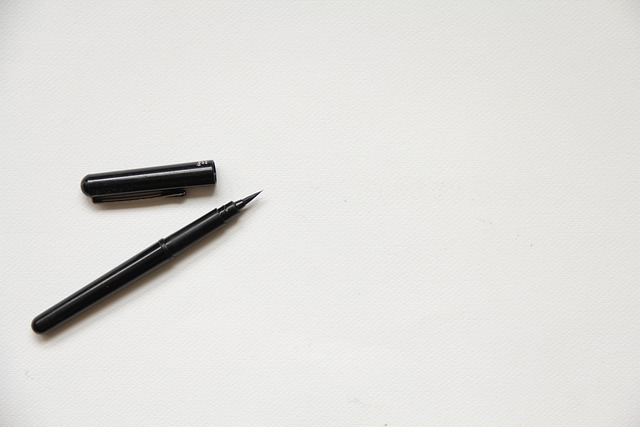
Modern & Brush Lettering
Modern calligraphy breaks from strict traditional rules, embracing personal expression and contemporary aesthetics. Brush pens, felt-tip markers and even everyday pens can be used. The emphasis shifts from historical accuracy toward individual style, creative composition and artistic experimentation.
- Flexible rules and personal expression
- Accessible tools and materials
- Suited to creative projects and branding

Gothic & Blackletter
Gothic or Blackletter calligraphy is characterised by its dense, angular letterforms. Developed in medieval Europe, this style uses a broad-edge nib at steep angles to create dramatic vertical strokes with narrow counter spaces. Textura, Fraktur and Rotunda are distinct variations within the Gothic family, each carrying regional and historical significance.
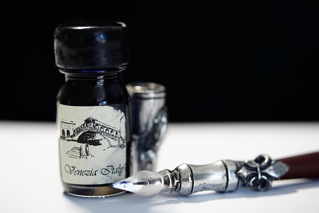
Uncial & Half-Uncial
Uncial script emerged in the early centuries of the Common Era and is distinguished by its rounded, open letterforms. Written with a broad-edge nib held at a relatively flat angle, Uncial letters have a warm, approachable character. Half-Uncial introduced ascending and descending strokes that eventually evolved into the lowercase alphabet used today.
Fundamental Concepts
The Building Blocks of Calligraphy
Understanding the principles that underpin every calligraphic style.
Pen Angle
In broad-edge calligraphy, the angle at which the nib meets the baseline determines the distribution of thick and thin strokes. A 45-degree angle creates balanced contrast, while steeper or flatter angles produce different visual effects. Maintaining a consistent angle throughout a piece is one of the fundamental technical challenges.
Nib Width & X-Height
Letter height in calligraphy is measured in nib widths — the distance across the flat edge of the pen. Different scripts specify different ratios. Foundational hand typically uses four to five nib widths for the x-height, while Gothic may use as few as three, creating its characteristic dense appearance.
Stroke Order
Every calligraphic letter is built from a specific sequence of strokes. Understanding the order in which strokes are made — and the direction of each stroke — is essential for achieving proper letterforms. Most strokes in Western calligraphy move downward and to the right, following the natural movement of the writing hand.
Interlinear Spacing
The space between lines of calligraphic text affects readability and overall visual density. Ascenders and descenders from adjacent lines should not collide. Generous interlinear spacing gives a page an open, airy feeling, while tighter spacing creates a more textural, tapestry-like effect.
Ink Flow & Loading
The amount of ink on the nib directly affects stroke quality. Too much ink creates blobs and uncontrolled thick areas. Too little ink produces scratchy, broken lines. Learning to load the nib consistently — whether dipping into a bottle or using a brush — is a practical skill that develops with experience.
Layout & Composition
Calligraphy extends beyond individual letterforms to the arrangement of text on a page. Margins, alignment, text hierarchy and decorative elements all contribute to the overall composition. Planning the layout before beginning to write helps prevent errors and ensures balanced visual results.
Getting Started
Your First Steps in Calligraphy
A thoughtful progression from basic strokes to complete letterforms.
Choose Your Tools
Select a writing instrument that suits the style you want to explore. A broad-edge nib for Italic or Foundational, a pointed nib for Copperplate, or a brush pen for modern calligraphy. Pair it with smooth, absorbent practice paper and quality ink.

Practice Basic Strokes
Before writing letters, practise the fundamental strokes that build them. Straight downstrokes, curves, branching strokes and connecting movements. Repetition builds the muscle memory that makes letterforms feel natural.

Build Letterforms
Combine basic strokes into individual letters. Study the construction of each character — where strokes begin and end, how they connect and what proportions define the style. Work through the alphabet methodically.

Write Words & Compositions
Connect letters into words, paying attention to spacing and rhythm. Then progress to short phrases and compositions, exploring layout, alignment and the relationship between text and the surrounding space.

Tools for Calligraphy
The Calligrapher's Essentials
Understanding the instruments that bring letterforms to life.
Broad-Edge Nibs
Broad-edge nibs have a flat, chisel-shaped tip that creates thick and thin strokes based on the direction of pen movement. Available in various widths — from 1mm to 6mm and beyond — they are used for Italic, Foundational, Uncial and Gothic styles. The width of the nib determines the scale of the letters: wider nibs produce larger letterforms, while narrower nibs suit smaller text.
Flexible Pointed Nibs
Flexible pointed nibs have a fine, sharp tip with tines that spread apart under pressure. Light pressure produces hairline strokes; increased pressure opens the tines, releasing more ink and creating thicker lines. This pressure-based contrast is the hallmark of Copperplate, Spencerian and modern pointed-pen calligraphy. Different nibs offer varying degrees of flexibility and sharpness.
Brush Pens & Markers
Brush pens combine the convenience of a pen with the expressiveness of a brush. They come in small, medium and large tip sizes and respond to pressure changes much like flexible metal nibs. Felt-tip calligraphy markers with chisel tips offer another accessible option for practising broad-edge styles without the need for dipping into an ink bottle.
Every nib has its own voice.
Ink for Calligraphy
Not all inks behave the same way in calligraphy nibs. Calligraphy-specific inks are typically formulated to flow smoothly, dry without feathering and produce sharp, crisp lines. Sumi ink, iron gall ink and modern calligraphy inks each have distinct qualities. The interaction between ink and paper surface is a critical factor in the final appearance of the work.
Paper Selection
Smooth, coated paper generally works best for calligraphy, especially pointed-pen work where hairline strokes can catch on textured surfaces. Layout paper, marker paper and dedicated calligraphy practice pads provide reliable surfaces for learning. For finished pieces, heavier-weight cotton or rag papers offer beautiful ink interaction and archival qualities.
Calligraphy in Practice
Where Calligraphy Lives Today
From personal practice to creative expression and beyond.
Envelope Addressing
Hand-addressed envelopes bring a personal, thoughtful quality to correspondence. Calligraphic addressing transforms a simple envelope into something worth saving — a visual introduction to the message inside.
Art & Wall Prints
Calligraphic lettering can stand alone as visual art. Quotations, poetry, single words and abstract letterforms become striking wall pieces when executed with skill and care on quality paper or other surfaces.
Journalling & Notebooks
Incorporating calligraphic elements into everyday journalling adds visual richness to personal writing practice. Decorative headings, illustrated initial capitals and hand-lettered titles bring creative energy to notebooks.
Wedding Stationery
Calligraphy remains deeply connected to wedding culture. Invitations, place cards, menus, table numbers and signage all benefit from the personal, handcrafted quality that calligraphy provides.
Mindful Practice
Many people discover that calligraphy offers a meditative quality. The focused attention, rhythmic movement and sensory experience of pen on paper can create a calm, absorbing creative practice apart from daily routines.
Creative Lettering Projects
From hand-lettered gift tags and bookmarks to chalkboard signs and greeting cards, calligraphy skills translate into countless creative projects. Each application offers a chance to experiment with different styles and materials.
Practice & Patience
Developing Your Calligraphic Hand
Consistent practice builds confidence and control.
Calligraphy is a skill that develops gradually through consistent, mindful practice. Unlike everyday handwriting, where speed is often the priority, calligraphy asks you to slow down and pay attention to every stroke, every transition and every space between letters.
Begin each practice session with warm-up strokes — rows of straight downstrokes, curves and ovals that loosen the hand and establish rhythm. Then move into letterforms, working through groups of related letters that share similar structural elements. Letters like n, m, h, b share a common branching stroke, while o, c, e, d share a curved foundation.
Regular short sessions tend to be more effective than occasional long ones. Even fifteen to twenty minutes of focused practice several times a week can develop noticeable improvement in stroke control and consistency over time.
Keep your practice sheets. Looking back at earlier work provides perspective on your development and helps identify specific areas that need attention. Every calligrapher, regardless of experience level, continues to refine and develop their craft.

Calligraphy FAQ
Common Questions About Calligraphy
Many teachers recommend Foundational hand or Italic as starting points for broad-edge calligraphy. These styles have clear, logical letter structures and relatively simple stroke sequences. For pointed-pen calligraphy, modern calligraphy (which allows more personal expression) is often more approachable than strict Copperplate or Spencerian.
Progress depends on how frequently you practise, which style you study and your existing familiarity with writing tools. Many people begin to feel more confident with basic letterforms after several weeks of regular practice. Developing consistency, fluidity and personal style is an ongoing process that continues to evolve over months and years.
Yes. Calligraphy and everyday handwriting are related but distinct skills. Calligraphy involves drawing letters deliberately rather than writing them quickly. Many accomplished calligraphers describe their everyday handwriting as unremarkable. The focused, slower pace of calligraphy creates a different experience from rapid everyday writing.
Absolutely. Left-handed calligraphers may need to adjust their paper angle, pen position or nib choice, but many left-handed writers practise calligraphy successfully. Some left-handed calligraphers use oblique pen holders or specially cut nibs designed for their writing angle. Pointed-pen calligraphy can be especially accommodating for left-handed writers.
Calligraphy is the art of writing — each letter is created with continuous strokes of a pen or brush. Lettering, by contrast, involves drawing or constructing letters, often built up from multiple strokes, outlines and fills. Calligraphy produces letters in a single pass; lettering treats each letter as an illustration. Both disciplines value beautiful letterforms but approach them from different directions.
An oblique pen holder positions the nib at an angle that makes it easier to achieve the correct slant for Copperplate and Spencerian calligraphy. While not strictly required — some calligraphers use straight holders successfully — an oblique holder can make pointed-pen calligraphy more comfortable, especially for right-handed writers. It is not used for broad-edge styles.
Continue Exploring
Discover More at BW ESS ITALY SRL
Calligraphy is one part of the wider world of writing.
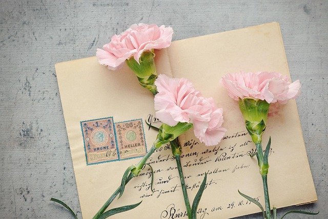
Everyday Handwriting
Explore letter formation, spacing, slant and consistency for everyday written communication.
Explore
Words & Spelling
Explore written English through word structure, commonly confused spellings and language examples.
Explore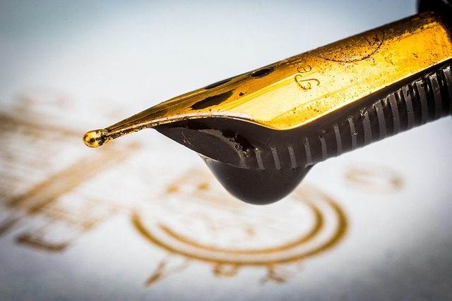
Pens, Ink & Paper
Understand how different writing instruments and surfaces influence the physical writing experience.
Explore